| Tikalon Blog is now in archive mode.
An easily printed and saved version of this article, and a link
to a directory of all articles, can be found below: |
|
This article |
| Directory of all articles |
Visualizing Science
November 9, 2010
Scientific visualization is a great tool, and you don't need to be an expert programmer to use its simplest form, the x-y plot. Data expressed in a graph are much easier to interpret than from a table, and I've often used
contour plots to pack the most information into one graph. Graphing isn't leading edge software, so it's no wonder that I used an ancient copy of
SigmaPlot from
Windows 98 through
Windows XP. It worked fine in all versions of Windows that I had, and it did everything I needed. Now that I use
Linux exclusively, I use
GNUPlot, but the built-in graphics capability of
GNUmeric is my usual choice.
Los Alamos National Laboratory did some interesting research last year in using scientific visualization to visualize
science and examine its connections to the
humanities.[1-4] What we call science is an odd collection of many diverse fields. Specialty is certainly the name of the game. As they say, "Scientists are people who know more and more about less and less, until they know everything about nothing." This is a quotation attributed to many people, so it's best just codified as one of
Murphy's Laws. A quick persusal of the
arXiv preprint server shows that in
physics alone, by my count, there are more than forty subfields. I must confess that a few papers in some of these fields are quite beyond my comprehension, a thought I expressed in a
previous article (Codex Arxivus, July 2, 2010). The Los Alamos research seeks to find connections between fields of science and perhaps identify what could be called
the next big thing by this process.
The Los Alamos team made an arrangement with twenty three online database providers, including
Elsevier,
Jstor,
Thomson Scientific,
Ingenta and libraries of the
California State University system, to anonymously capture and analyze their users' click habits; specifically, the team was interested in how scientists would hop between articles in different specialty journals. Their dataset, based on transactions between March 1, 2006, and February 1, 2007, encompased 97,532 serial publications. These were not just scholarly journals, but also weekly magazines and newspapers. In this way, the Los Alamos team was able to map the connections between scientific fields, as shown in the figure. The figure is a synthesis of 346,312,045 transactions.
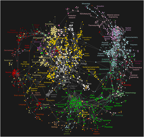
Map showing connections between scientific disciplines. (click for larger version; from Ref. 5)
Not surprisingly, the analysis was via a first-order
Markov chain model. It's proposed that this figure shows the current connection between disciplines. The Los Alamos team argues that their method is superior to
citation analysis, since it captures interest in journal articles in the social sciences and humanities that aren't widely cited, but are still widely read. Also, the delays inherent in print publication mean that even a widely cited paper will not begin to rank highly in citations for several years, essentially because the delay of publication of the cited paper is compounded with the delay in publication of the citing paper.
An emergent field of study can be identified readily. If a database user accessed an article on the properties of a particular
alloy and then jumped to an article on
nickel, that wouldn't be a particularly interesting event. If he accessed an article on
synthetic elements and then jumped to an article on
genetic engineering, that would be an unusual connection. If the system noted a clickstream like this from several users, this might mark the begining of a new research area.
DARPA,
DOE and
NSF program managers might find this a useful tool, although it might be too easy for
principal investigator hopefuls to
game the system.
Commentators point to the connections evident between the sciences and the humanities,[3] but I think this diagram actually reaffirms the cultural divide between these
two cultures. The diagram reminds me more of a
left-brain/right-brain dichotomy than a unification.
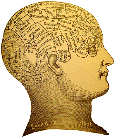
Source: Friedrich Eduard Bilz (1842-1922):
Das neue Naturheilverfahren (1894).
![]()
References:
- Declan Butler, "Web usage data outline map of knowledge," Nature, March 9, 2009
- Brandon Keim, "Map of Science Looks Like Milky Way," Wired, March 11, 2009
- Greg Boustead, "A New Picture of the Two Cultures," Seedmagazine.com, March 20, 2009
- Johan Bollen, Herbert Van de Sompel, Aric Hagberg, Luis Bettencourt, Ryan Chute1, Marko A. Rodriguez and Lyudmila Balakireva, "Clickstream Data Yields High-Resolution Maps of Science," PLoS ONE, vol. 4, no. 3 (2009), article e4803 .
Permanent Link to this article