| Tikalon Blog is now in archive mode.
An easily printed and saved version of this article, and a link
to a directory of all articles, can be found below: |
|
This article |
| Directory of all articles |
Lousy Science Yields Good Art
June 25, 2010
Getting data is one thing, but understanding data is another thing altogether. In the early days, experiments were simple, but data were very hard to obtain, so it was typically easier to make sense of the few data point you had. When I was a postdoc, an old professor recounted to me how one of his earlier experiments involved measuring the position of a spot of light projected on a wall. The spot of light came from a mirror that was mounted on a device that moved just a small bit. Bouncing light from the mirror amplified the position changes so they could be read.
Now, things are easier in some respects, but harder in others. With the advent of ubiquitous computing, we are now drowning in data, stealthily hiding in
memory sticks that are so small we have a difficult time finding them in our pockets. Just a few decades ago, graphs were still sufficient to illustrate data trends and confirm hypotheses. The lines were smoother, since we had a lot of data points and
data smoothing algorithms. Line graphs can convey a lot of information, especially if they are constructed in unusual ways. Since 1983, when he published his book, "The Visual Display of Quantitative Information," [1]
Edward Tufte has been a proponent of graphics that convey information more clearly.
One example that Tufte popularized is the
map [2] by
Charles Joseph Minard that displays the losses in
Napoleon's army during the 1812
French invasion of Russia. On that map, a line depicting the army's travel stretches from France to Moscow, and then back to France. What's unique about this line is that its width represents the size of the army. It starts out fat in France as the troops leave for Moscow, and then it shrinks along the way, finally becoming a very thin line after the round trip. Tufte has written an essay,
"The Cognitive Style of PowerPoint", in which he criticizes the way that data are distilled down to nothingness so that they can fit into a slide format.
Now, when all the low-hanging fruits have been plucked from Nature, experimentalists have had to look a lot harder for something new. Instead of just varying one parameter at a time, it's typical now to vary several and then use computers and
multivariate analysis to determine their affects. Sometimes, things are so complex that it's difficult to get a mental image of what's happening. That's when
data visualization techniques are required.
At the same time that computers were making data easier to obtain, they were also enabling computer graphics. My son and I were witnesses to the progress of computer graphics through the
SIGGRAPH Animation Theater and Electronic Theater presentations that were replayed at the
Trenton Computer Festival. This is an annual computing event in our home state that's hosted by the
Amateur Computer Group of New Jersey. Using graphics techniques, large data sets can be made more understandable by coloring, 3D representations and animation. For example, the hot gas stream through a turbine engine can be colored on a temperature scale and combined with a cross-sectional diagram of the engine. An animation might then be made to show how these temperatures change as a function of turbine speed, allowing engineers to highlight areas of the engine that might need improvement.
At this point, you're wondering about the "Lousy Science" part of this article's title. As I was doing my weekly reading, I noticed an article in the
Proceedings of the National Academy of Sciences that describes the genome of the human
louse [3]. The lead author is Ewen F. Kirknessa of the
J. Craig Venter Institute, and the article has 70 other authors from many institutions.
Genomics is somewhat outside
my areas of expertise, but I was impressed by a diagram (in modified form, below) that shows the overlap of genes of the louse with other species. Not only is this good data visualization, but it has a pleasant appearance.
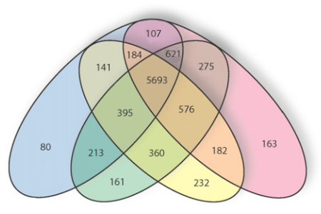
Overlap of genes of louse and other species. Pink, P. hum; yellow, N. vit; green, T. cas; blue, D. mel.
![]()
References:
- Edward Tufte, "The Visual Display of Quantitative Information," Graphics Press (Cheshire, CT., 1983).
- Poster of Napoleon's March sold on Tufte's website.
- Ewen F. Kirknessa, et al., "Genome sequences of the human body louse and its primary endosymbiont provide insights into the permanent parasitic lifestyle," (To appear, PNAS, 2010).
- Edward Tufte's personal website.
Permanent Link to this article